Using Layar and Hoppala I plan to embed 3D models of concepts, ideas and objects into the AR world of the UNSW campus, in order to act as an interesting and interactive guide for new students to UNSW, and as an alternate form of interaction between current students and the buildings.
The 3D models will consist of metaphors for existing campus life culture icons, directions to variations points of interest, labels of various important buildings and in in some cases just simple installation art to enhance the feel of certain spaces in the university.
Hopefully a layar can be achieved that will comprise of these models that will enhance the users experience of the university.
Thursday, January 20, 2011
Sunday, January 16, 2011
Final Augmented Reality
The completed AR construction creates a media and entertainment room as you can see below.
This assignment only contained a few steps, however these steps for some reason, still took a huge amount of time. For example, eventhough a model is exported from an origin in the 3D modeling tool, for some reason Build AR still puts it off the charts somewhere off your screen.
The second issue was units. For some reason units always come out screwed up in Build AR, regardless of your export settings. I exported separate parts from a single model, and yet Build AR interpreted them as completely different scales. So that took a bit of tweaking as well.
So after all the tweaking and fiddling the scene finally came together as follows.
Windowed Wall


For this model I utilised the symbol that represents light. As this wall is the natural light source for the room, so it was only appropriate to label it as such.
The Audio Equipment


This wall is where the sound equipment for the room is situated and naturally the symbol used for this was an element giving off sound waves.
The Room Structure


This model was the main frame of the room, which included the main seat of the room from where the inhabitant would be situated while interacting with the room. As a main point of interaction being the seat, I used the side view of a gaming seat as the symbol for the part of the room.
Completed Gaming Room

As one can see in the above picture this is the complete room. The elements are slightly offset, but the UI of Build AR is so sensitive that adjusting these tiny differences are near impossible, unless using the coordinate inputs.
The complete AR construction consists of three markers, with three separate 3D models. Combined they create separate major sections of a room that is designed, and solely dedicated to media and entertainment. I thought this was appropriate as the theme of this assignment is AR.
Saturday, January 15, 2011
Augmented Reality
Augmented Reality HUD Glasses
Hopefully this arrives sooner than people would like to think.
This is my inspiration as I enjoy the act of phyiscally interacting with the AR and the AR actually becoming a tool rather than simply a visual effect. Interactive buttons on a programmable interface are what attracts me to AR.
Google Warehouse Model
Frank Lloyd Wright - Falling Water
Google Warehouse Model - Link


This model took a little bit of tweaking but I eventually got it into BuildAR alright.
Sunday, January 9, 2011
Final Submission
Coming into the final stages of the assignment there's been a few hitches. Having PhotosynthToolKit transfer from lab computers and start running a bit strangely, only to realise a little bit late that the file was corrupt, however after getting a fresh version, it appeared to begin running as it should.
Final Concept
The typical university campus consists of many buildings with their own functions and meanings, connected only by the strings of a society attempting to educate it's populous. Other than that the university attempts to create an on-campus environment by running events, allowing student run societies to advertise their own hopeful, yet somewhat detached, idea of a community.
In all honesty I like societies and the community they generate but they really do segregate the university community as a whole. You have business students running off on their own commercial tangents, while the law students attempt to draw the circle of law which the former party's tangent diverges from. You then have the beer chugging engineering students who are ironically meant to make stuff work (they're still good blokes), and then the minorities of science, architecture and arts attempting to make their own way along side the titans of the aforementioned faculties, all the while leaving the med students to exist only in their exclusive cliques learning about how terribly fragile the human design is, with, I'll admit as depressing as they are, incredibly necessary aims to keep the rest of us from kicking the bucket too early because we've run head on into eachother. However, the point is that the university community is growing larger, and as it does this it separates the community on the whole. Therefore my proposed building theory is to recreate certain sections of the campus on the interior space of a dome in order to hold them together in a space, rather than allowing them to spread outwards.
Renders and Photos

Close-up

Top

Oblique View
Ideas and Drawings
My concept as explained in a previous post is based on an dome shape, loosely based on the snow globe. In this first drawing I've illustrated a view from the middle of the building looking up at the buildings. In the foreground you can see the faculties of the university sitting side-by-side all facing inwards towards a central courtyard. In the background you can see the rocky mountainous area into which the buildings are embedded.

In this next image, you can see a sectioned version of the structure, with the other end of the courtyard in elevation, and the interior tunnels, and rooms to the left and right within the mountains/buildings. Below you can see the dome shape of the structure, in which the whole university is built in order to keep the community together.

Both drawings show a bit more building matter than will be in the final model, however the final model is simply a conceptual prototype of what the envisioned building is to look like.
Inspiration
My inspiration came from the traditional snow globes of Christmas time, except the dome shape I will be using has the rounded end sitting on the bottom. The idea came more from the concept, than it did from any pictures that I'd seen, or patterns, but I guess thee images could sum up in short what I'm attempting to recreate.

Boyne Snow Globe, Mostly Collectables, http://www.mostlycollectibles.com/SnowGlobes.html, (accessed 8 January 2011)
I liked this snow globe because it included a biulding in it, which is one step towards the vision I had. The concept of a building within the dome is halfway there in this picture already.

Snow Globe, Download-A-Rama, http://www.downloadarama.com/screensavers/seasons/winter.html, (accessed 8 January 2011)
I like this snow globe as it has a full scene with a background in it, rather than a object where you are to imagine the background. This snow globe is taking you into the world inside it, by completing the scene for you.

Snow Globe Central Park, Bildungblog, http://bildungblog.blogspot.com/2008_12_14_archive.html, (accessed 8 January 2011)
This particular image is amazing. I like the fact that the form of the tunnels end is creating a snow globe for your eyes, yet there is not actual snow globe there. Your eyes are doing the creating here, and

Snow Globe, NewYorkology, http://www.newyorkology.com/archives/2007/12/canadians_bring.php, (accessed 8 January 2011)
This is an awesome picture once again, as it depicts a lifesize snow globe with people in it. This is once again making the idea of a snow globe in a larger format more real.
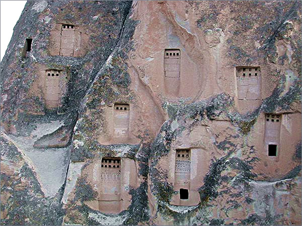
As much as the dome I am using is upside-down, the snow globe still seems to be one of the most influential objects for me right now. However, buildings cut into the sides of rocks has had an almost equal influence on me, as for the inside of the dome, the buildings side against the interior, as if they too were cut into the rocky walls of a mountain, with interconnecting pathways from faculty to faculty. The following images serve their own purpose in my concept.

Cave Houses, TravelPod, http://www.travelpod.com/travel-blog-entries/kickthrough/1/1248466879/tpod.html, (accessed 8 January 2011)
I like this image because the houses are not only carved into the rock, but it's into a rock that is already farily similar in shape to an actual house, rather than carved into the side of a mountain. The house is almost tricking us into believing that it was meant to be inhabited by people.
Alison Gardner Rock Houses, Transitions Abroad, http://www.transitionsabroad.com/publications/magazine/0411/ballooning_in_cappadocia_turkey.shtml, (accessed 8 January 2011)
I like this image a lot because the housing is not elborate and open chambers. they are simple square shaped carvings which give the illusion of straight structured housing, whereas if one goes inside, the actual spaces on the inside may be very different. This idea is used in my concept in order to create an interior which exceeds the knowledge of the mind when it first perceives the building.

Houses in the Rock. Carto, http://www.carto.net/neumann/travelling/santorini_2004_05/02_fira_boatride_in_caldera_2004_05_26/15_houses_in_the_rock.jpg, (accessed 8 January 2011)
This building is interesting as it has actually been built into the rock, with cave -like spaces beneath it. My concept, as it is a university will actually be built into the rock faces of the dome, however the idea is to create something that looks like it has been built into the rock. This image therefore ties in nicely with the more logical and practical side of my concept.
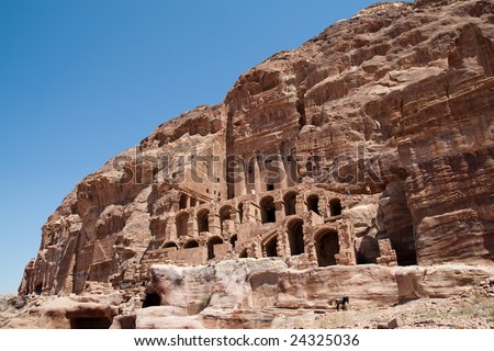
Houses in the Rocks, Shutterstock, http://image.shutterstock.com/display_pic_with_logo/328855/328855,1233612586,263/stock-photo-houses-in-the-rocks-24325036.jpg, (accessed 8 January 2011)
This image was chosen simply because it is close to what I originally envisioned when considering building into a rockface. This structure is quite elaborate, and detailed, which mystery of it's interior. It is also a full multi-storey structure, as opposed to the simpler structures I had shown previously.
Boyne Snow Globe, Mostly Collectables, http://www.mostlycollectibles.com/SnowGlobes.html, (accessed 8 January 2011)
I liked this snow globe because it included a biulding in it, which is one step towards the vision I had. The concept of a building within the dome is halfway there in this picture already.
Snow Globe, Download-A-Rama, http://www.downloadarama.com/screensavers/seasons/winter.html, (accessed 8 January 2011)
I like this snow globe as it has a full scene with a background in it, rather than a object where you are to imagine the background. This snow globe is taking you into the world inside it, by completing the scene for you.
Snow Globe Central Park, Bildungblog, http://bildungblog.blogspot.com/2008_12_14_archive.html, (accessed 8 January 2011)
This particular image is amazing. I like the fact that the form of the tunnels end is creating a snow globe for your eyes, yet there is not actual snow globe there. Your eyes are doing the creating here, and
Snow Globe, NewYorkology, http://www.newyorkology.com/archives/2007/12/canadians_bring.php, (accessed 8 January 2011)
This is an awesome picture once again, as it depicts a lifesize snow globe with people in it. This is once again making the idea of a snow globe in a larger format more real.
As much as the dome I am using is upside-down, the snow globe still seems to be one of the most influential objects for me right now. However, buildings cut into the sides of rocks has had an almost equal influence on me, as for the inside of the dome, the buildings side against the interior, as if they too were cut into the rocky walls of a mountain, with interconnecting pathways from faculty to faculty. The following images serve their own purpose in my concept.
Cave Houses, TravelPod, http://www.travelpod.com/travel-blog-entries/kickthrough/1/1248466879/tpod.html, (accessed 8 January 2011)
I like this image because the houses are not only carved into the rock, but it's into a rock that is already farily similar in shape to an actual house, rather than carved into the side of a mountain. The house is almost tricking us into believing that it was meant to be inhabited by people.
Alison Gardner Rock Houses, Transitions Abroad, http://www.transitionsabroad.com/publications/magazine/0411/ballooning_in_cappadocia_turkey.shtml, (accessed 8 January 2011)
I like this image a lot because the housing is not elborate and open chambers. they are simple square shaped carvings which give the illusion of straight structured housing, whereas if one goes inside, the actual spaces on the inside may be very different. This idea is used in my concept in order to create an interior which exceeds the knowledge of the mind when it first perceives the building.
Houses in the Rock. Carto, http://www.carto.net/neumann/travelling/santorini_2004_05/02_fira_boatride_in_caldera_2004_05_26/15_houses_in_the_rock.jpg, (accessed 8 January 2011)
This building is interesting as it has actually been built into the rock, with cave -like spaces beneath it. My concept, as it is a university will actually be built into the rock faces of the dome, however the idea is to create something that looks like it has been built into the rock. This image therefore ties in nicely with the more logical and practical side of my concept.
Houses in the Rocks, Shutterstock, http://image.shutterstock.com/display_pic_with_logo/328855/328855,1233612586,263/stock-photo-houses-in-the-rocks-24325036.jpg, (accessed 8 January 2011)
This image was chosen simply because it is close to what I originally envisioned when considering building into a rockface. This structure is quite elaborate, and detailed, which mystery of it's interior. It is also a full multi-storey structure, as opposed to the simpler structures I had shown previously.
Saturday, January 8, 2011
Gathering Buildings
I attempted to gather a few more synths of buildings around campus in order to bulk up the model a bit, with some but not a lot of success. On top of the fact that the sun was burning me on the spot, the Red Centre and Rupert Myers Theatre didn't turn out as synthy as hoped.
The Red Centre 43% Synthy

The Red Centre came out nicely, yet in parts, so I'm not suite sure yet how it will look in meshlab, but hopefully it's enough to create a mesh worth looking at. I think it might have been simply too big to cover properly, with out going crazy with the amount of photos taken.
Rupert Myers 29% Synthy

Rupert Myers turned out a lot worth than expected. I thought that the certain feautres on it's corner points might allow for some kidna of easy recognition, but apprently not. I think two photos were linked properly, and the other kidn of had their own separate point clouds attached to them. This type of building, was a bad choice.
Mechanical Engineering Building 53% Synthy

I also attempted the Mechanical Engineering Building again this time, getting a slightly lower synth value of 53%(as opposed to the previous 68%), but a much better and workable point cloud. I think is because I'd managed to get clearer shots in sunlight, and also cut out muhc of the surrounding environment in the photos, giving Photosynth less material to make mistakes with.
Now the work on the conglomeration begins.
Thursday, January 6, 2011
When the inside turns out.
So my final concept was the machination of various faculties and buildings on campus into a single building that is turned inside out.
The typical university campus consists of many buildings with their own functions and meanings, connected only by the strings of a society attempting to educate it's populous. Other than that the university attempts to create an on-campus environment by running events, allowing student run societies to advertise their own hopeful, yet somewhat detached, idea of a community. In all honesty I like societies and the community they generate but they really do segregate the university community as a whole. You have business students running off on their own commercial tangents, while the law students attempt to draw the circle of law which the former party's tangent diverges from. You then have the beer chugging engineering students who are ironically meant to make stuff work (they're still good blokes), and then the minorities of science, architecture and arts attempting to make their own way along side the titans of the aforementioned faculties, all the while leaving the med students to exist only in their exclusive cliques learning about how terribly fragile the human design is, with, I'll admit as depressing as they are, incredibly necessary aims to keep the rest of us from kicking the bucket too early because we've run head on into eachother. However, the point is that the university community is growing larger, and as it does this it separates the community on the whole. Therefore my proposed building theory is to recreate certain sections of the campus on the interior space of a dome in order to hold them together in a space, rather than allowing them to spread outwards.

Rough drawing of concept
The idea is to bring all the faculties into a single enclosed space, which as architecturally constraing as it is, still has it's upsides. The community has had it's "insides turned out", which resultantly has broughts the exteriors of the buildings "in". The dome on the exterior of this concept is metaphorical for the unstable nature of our lives at university. It is a stage of our lives where we are slightly in limbo. We have direction, but it can easily be altered, as we have course options, degree options, jobs options. So many options that are defining, which make unstable, not in the sense that it could fall apart(hopefully), but because the possibilities are many.
The building being on the interior is simply to bring the faculties, as mentioned before, together and closer into a more close-knit community.
Synths
The buildings chosen thus far are based on aesthetic and ease of synthing value, not for any other reason. Of course if it was possible there would be a balanced choice of the varying faculties to represent the various different communities within the university. Alongside other buildings such as social, banking, health and fitness, and eating facilities.
Chemical Sciences Building 68% Synthy(bad synthing - the ground was synthed as a result of more vibrant outer environment)

Quad Food Court 63% Synthy

Quad Lawn Tower 100% Synthy

Mechanical Engineering Building 82% Synthy

These synths will be used as the major interior of the conceptual model of the university.
Little development, lots of progress
So far most of the recent synth's I've attempted have come out null, well, sort of.
I've attempted to crewate a synth of a ice-cream shaped eraser, which came out with 0% synthy. This I assume is because the eraser was black, and although the photos were close-up shots, and did the object was very matt(low reflectivity), there was not nearly enough for Photosynth to use as reference points. The outcome would have to be that the object was much too simple and simply wasn't suitable for the process.

Note: use objects with varying colours
After this development I attempted the Library Lawn Clock, which resulted in 100% synthy, yet to my surprise synthed not the clock, but the bright green grass on the lawn, as seen here. A rather strange result, but what i can discern from this result is that when taking photos try to avoid objects with very vibrant and textured backgrounds. Or you can photoshop them out. Either way should work fine. The reason I never attempted to photoshop this out was because not only was there bright green grass yet, there was a large brick textured wall behind the clock. Time simply wasn't on my side. But it's still an option.

Note: Avoid vibrant and more appealing backgrounds, or be ready to edit the peanuts out of your photos
I then tried the Mechanical Engineering Building(only the face seen from the main walkway) which turned out quite well actually. The synth was only 87% or so, but at least Photosynth stitched them together properly. I think this worked because the background of the images wasn't as vibrant or distinctive as the grass in the library lawn, and there was some textural variation on the building which helped to decipher what was what. The paved ground around it was also slightly washed out from the light. I of course only have one face for the moment, yet it was quite a development from the last two failures. As bad as they were I still seemed to learn what not to do next time.

Note: Washed out backgrounds work well
Having done a building finally, I decided that it would be an interesting idea to splice an actual building and a balsa wood model of a building. I thought that maybe the textured wood might help as it was not very reflective, and it had a lot of distinct features for Photosynth to tag onto. The outcome, however, was a 0% synthy. This I think was due to the fact that the artificial lighting of a bedroom washed out the texture of the wood, instead of the surrounding material. An option, which is yet to be attempted is to lower the light levels of the images in order to amplify the texture in the balsa wood. As the due date ahs been extended this might still be attempted, as before time would not allow for such a terrible result. I need 100% synthy.

Note: Lower light levels to enhance texture variation
The last attempt at finding 100% synthy I decided to use one of the last remaining matt objects in my apartment; a christmas hat.
I didn't think it would work originally, however I saw some really promising results in class where other students had used teddy bears, and other felt/furry type objects, so I assumed there was something about this texture that seemed to work regardless of it's reflectivity. Alas, all it mounted up to was a lowsy 27% synthy. I think the difference between the christmas hat and the teddy bear was the colour variation. The christmas hat was a consistent red and green on it's respective parts, yet the teddy bear had shades of brown, and other distinct features that defined the head, arms body and legs. I decided to try sticking board pins into the hat as a last reach attempt, yet this only decreased the synthy to 21%.

Initial attempt at the christmas hat

Second attempt with pins in the hat
I think this object was however just too simple, and Photosynth struggled to find it's bearing. Another option which might be a possibility is to attach points with letters on, as another student did in class. This might make a simple object easier to synth.
Note: avoid simple objects
Observation Summary
- use objects with varying colours
- Avoid vibrant and more appealing backgrounds, or be ready to edit the peanuts out of your photos
- Washed out backgrounds work well
- Lower light levels to enhance texture variation
- avoid simple objects
Tuesday, January 4, 2011
First Working Synth
The first two synths I attempted to create resulted in an embarassing 0% Synthy.
I assume this occured because the objects were too reflective.
I chose to do a rubiks cube first as it had many distinct colours with which to work with, however there might have been too many similar colours on each face and Photosynth became confused, and the aforementioned high reflectivity of the coloured surfaces.

The second choice was a USB thumb drive. It was simple and had a few distinct features on it like a brand label, a string attached to one end and a green grip. however the rest of the body was silver plastic and probably reflected too much, as well as being too constistent across the surface giving Photosynth a bit of a hard time.

My third and 100% synthy choice was a Mario phone sock. It has distinct colour features on it and is very unreflective as it is made from cotton fabric. I didn't take as many photos as I did with the original two as a time-saving decision in case this too didn't work, however it still resulted in a 100% synth.

Here is the outcome.
Phone Sock
I was not as pleased as I'd hoped to be with the outcome, as there are not that many feature points in the point cloud however it is still a successful result and should help with the rest of the exercise.
Subscribe to:
Posts (Atom)